
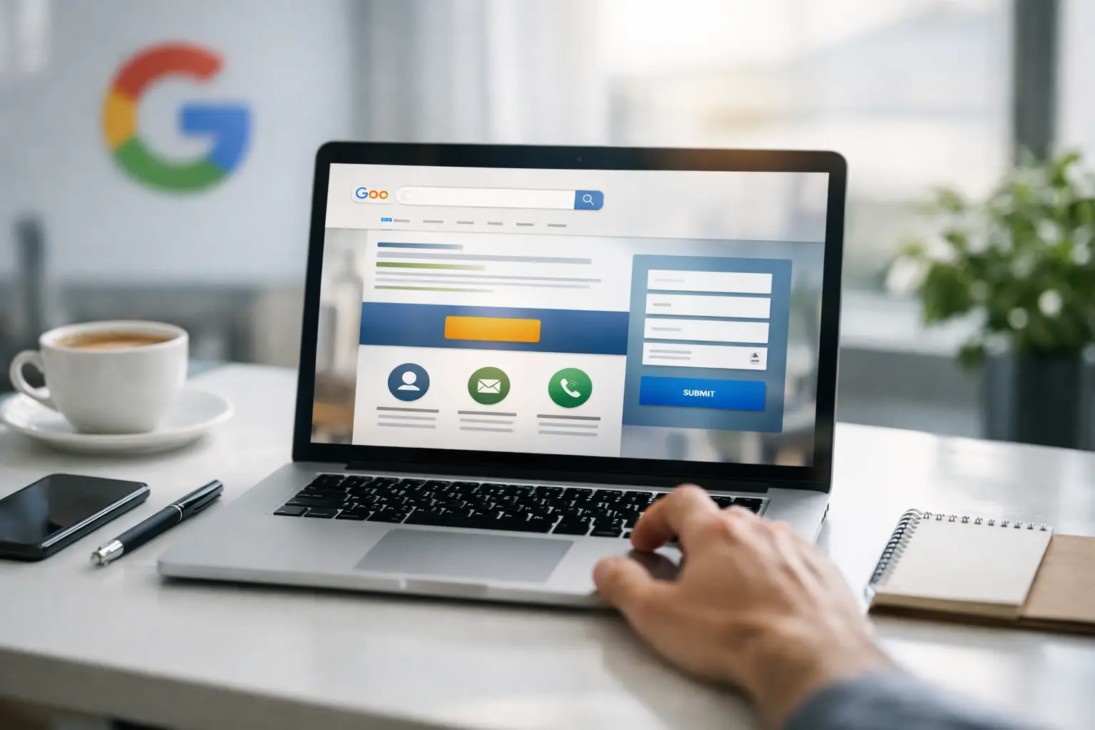
A click from Google Ads can cost several pounds, sometimes considerably more in competitive local services. Sending that visitor to a generic homepage and hoping they find the right information is an expensive gamble. A focused Google Ads landing page gives them a clear next step while the reason they searched is still front of mind.
For small and mid-sized businesses, this is often where paid campaigns succeed or fail. Your advert may be well targeted and your budget may be sensible, but if the page feels vague, slow or difficult to trust, the enquiry never arrives. The good news is that improving a landing page is rarely about clever tricks. It is about clarity, relevance and removing unnecessary friction.
What a Google Ads landing page is meant to do
A landing page is the page someone reaches after clicking an advert. Unlike a standard website page, it should be built around one service, offer or search intention. Its job is not to tell the whole story of your business. Its job is to help the right person decide whether to call, request a quote, book a consultation or take another meaningful action.
That focus matters because a paid visitor is different from someone casually browsing your website. They have actively searched for a solution. If they searched for “emergency plumber in Leeds”, they need reassurance that you cover Leeds, can respond quickly and are qualified to do the work. They do not need to dig through a broad navigation menu, read your company history or guess whether you offer emergency appointments.
A good page also supports better ad performance. Google looks at the relevance and usefulness of the page behind an advert. A close match between the search term, advert and landing page can help improve quality signals, which may reduce the cost of attracting the right click. It will not rescue a poor campaign on its own, but it is a key part of using your budget properly.
Start with the searcher’s intent
Before choosing a headline or adding a form, decide exactly what the visitor wants. This sounds obvious, but many campaigns become muddled because one page tries to appeal to everyone.
Someone searching for “accountant for limited company” is likely assessing expertise and ongoing support. Someone searching “self assessment tax return help” may need a faster, more specific answer. Both could become valuable clients, but they should not necessarily land on the same generic page.
Match the wording of the page to the wording and promise of the advert. If your ad mentions a free site survey, make that offer visible as soon as the page loads. If the campaign targets a specific area, name the area naturally and explain your coverage. This reassures visitors they are in the right place without stuffing the page with awkward keywords.
One page, one primary action
Choose the action that makes commercial sense for the service. For a high-value project, such as a new website or a kitchen installation, a quote request or consultation booking may be the right ask. For an urgent service, a prominent phone number and click-to-call button are usually more useful.
Trying to collect a call, a newsletter sign-up, a brochure download, a social follow and a quote request on one page creates hesitation. Keep one primary call to action, then repeat it at logical points as the visitor reads. A secondary option can help, such as a phone number for people who prefer to speak to someone, but it should not compete with the main goal.
Build the page around proof, not puff
A visitor should be able to answer three questions within a few seconds: what do you offer, who is it for and what should they do next? The top section of the page needs a direct headline, a short supporting statement and a clear call to action.
For example, a vague headline such as “Quality solutions for your business” gives nobody a reason to stay. “Professional Google Ads management for local businesses that need more enquiries” is clearer because it states the service, audience and outcome. It makes a promise you can then support with evidence.
That evidence should appear early. Depending on the business, useful proof includes genuine client testimonials, review ratings, project examples, relevant accreditations, years of experience, named team members or a clear explanation of how the service works. Do not add every badge you have ever received. A small amount of credible, relevant proof is more persuasive than a crowded strip of logos.
Be specific about practical benefits. Instead of saying your team provides an “exceptional service”, explain what the client receives: fixed appointment windows, a response within one working day, transparent monthly reporting, or a detailed quote before work begins. Plain English builds more trust than grand claims.
Keep forms short and easy to complete
Every extra field in a form gives someone another reason to leave. Ask only for the information needed to begin a useful conversation. For many service businesses, that means name, phone number or email address, a short message and perhaps postcode or preferred contact time.
Long forms can make sense where a business needs to qualify leads before arranging a visit or preparing a detailed proposal. Even then, consider whether the questions can be split into stages. The trade-off is simple: more information may save your team time, but it can also reduce the number of enquiries. The right balance depends on your capacity, job value and how quickly you can follow up.
Tell people what happens after they submit. A line such as “We will call you within one working day to discuss your project” makes the next step feel less uncertain. If you offer a free consultation, be clear about what it includes and whether there is any obligation.
Remove the common conversion blockers
Most landing-page problems are not dramatic design failures. They are small sources of doubt that build up quickly. A page that takes too long to load, hides its contact details, uses stock imagery with no context, or opens with a wall of text makes visitors work harder than they should.
Mobile deserves particular attention. Many Google Ads clicks happen on a phone, often while someone is comparing options between meetings or looking for a quick answer. Buttons need to be easy to tap, text needs room to breathe and the form should not feel like admin on a small screen. Test the full journey yourself on a mobile device, including the thank-you page and any confirmation email.
Avoid sending paid traffic to pages with distracting pop-ups, multiple menu routes or unrelated promotions. A navigation menu is not always wrong, especially for a brand people need to research carefully, but it should not pull attention away from the campaign’s purpose. For a local trades campaign, less choice is usually better. For a specialist B2B service, visitors may need more detail and stronger credentials before they are ready to enquire.
Measure the actions that matter
A Google Ads landing page should not be judged by traffic alone. The number that matters is whether suitable visitors take the intended action and become worthwhile leads.
Track form submissions, phone calls from the page, booked appointments and, where possible, the leads that turn into paying clients. A campaign producing ten cheap enquiries is not automatically better than one producing four high-quality enquiries. Sales feedback is essential here. If the leads are unsuitable, the issue may be the advert targeting, the offer, the form questions or the message on the page.
Use the data to make focused changes. Test one meaningful element at a time, such as the headline, call-to-action wording, offer or form length. Changing everything at once may produce a better result, but you will not know why. Give changes enough traffic and time to be useful, particularly if your service has a low search volume.
Treat the page and campaign as one system
Your advert, keywords, audience targeting, landing page and follow-up process all affect conversion. There is little value in improving one part while ignoring the rest. A brilliant page cannot overcome an advert that attracts the wrong people, and a strong campaign will still lose momentum if enquiries sit unanswered for two days.
At MAWEBDESIGN, we see the best results when businesses stop treating paid ads as a switch they turn on and start treating them as a managed route from search to sale. That means clear messaging, honest reporting and regular improvements based on what real prospects do.
Your next paid click is not just a visitor count. It is someone looking for an answer, often comparing you with several alternatives. Give them a page that makes the answer clear, credible and easy to act on, then make sure someone is ready to respond.